The new year is around the corner, and major paint manufacturers and color forecasters have already crowned their color of 2019. Spanning the color spectrum from cool grays to warm terra-cottas, to blush oranges, these five color trends are expected to dominate the design and manufacturing industries in the coming year.
Warm Terra-cottas

“A nod to mid-century modern style” is how Sherwin-Williams describes its 2019 color of the year. “Cavern Clay embodies renewal, simplicity, and free-spirited, bohemian flair,” says Sherwin-Williams' director of color marketing Sue Wadden. This warm, terra-cotta hue is down to earth, welcoming, and refined, and pairs well with warm grays, deep browns, mid-tone blues, and warm neutrals. Sherwin-Williams recommends using this color with Moth Wing SW 9174 (warm taupe), Dark Clove SW 9183 (deep brown), Distance SW 6243 (rich, calming blue), or Origami White SW 7636 (neutral white) to create a balanced, sophisticated look in interior or exterior spaces. sherwin-williams.com
Mid-tone Blues

Behr's color of 2019 aims to be timeless, modern, approachable, and calming. This mid-toned denim blue “makes it easy for homeowners and apartment dwellers across the country to reimagine their space,” says Behr chief marketing officer Jodi Allen. To add depth and versatility, Behr suggests pairing Blueprint with Amber Autumn S290-5 (warm, golden beige), Ecological S380-6 (soft, warm green), Elephant Skin PPU18-16 (warm, mid-toned taupe), Sand Dance S190-2 (warm, peachy-pink), and Antigua M460-7 (vibrant blue-green). behr.com
Calm Grays
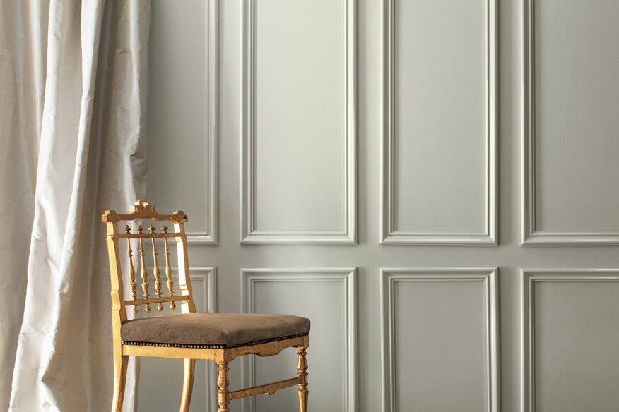
This light gray hue with cool undertones is Benjamin Moore's color of the year. “Metropolitan reflects the modern sophistication of 21st-century design,” the company writes on its website. The inherent serenity of this gray helps create a soothing and airy feeling in interior spaces or a sophisticated look on exteriors. “It’s a color in the neutral spectrum that references a contemplative state of mind and design,” says Benjamin Moore director of strategic design intelligence Ellen O’Neill. Along with the Metropolitan, Benjamin Moore has introduced a palette of 15 harmonious colors that complement its color of the year. Benjamin Moore suggests pairing Metropolitan with metallic accents and a navy blue color such as Hale Navy HC-154, a saturated classic green such as Hunter Green 2041-10, or a rich charcoal gray such as Kendall Charcoal HC-166. benjaminmoore.com
Classic Greens

PPG's color of the year is a deep hunter green that aims to invoke the invigorating impact of nature. Night Watch “can be especially impactful in places without any view or tie to the outdoors, like the end of a windowless hallway of a hospital,” says PPG senior color marketing manager Dee Schlotter. But this classic green shade works well on most of the interior and exterior surfaces. Use it on one interior wall to create a focal point or apply it onto the exterior façade, doors, or shutters for an easy curb appeal makeover. In addition, Night Watch works particularly well when paired with gold or brass accents. ppgpaints.com
Blush Oranges
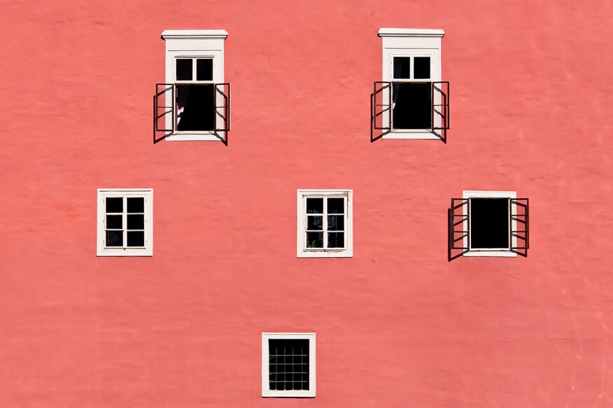
With just a hint of gold undertone, this “vibrant yet mellow” blush orange was inspired by oceanic coral reefs. “Color enhances and influences the way we experience life,” says Pantone Color Institute vice president Laurie Pressman. “As a shade that affirms life through a dual role of energizing and nourishing, ... Living Coral reinforces how colors can embody our collective experience and reflect what is taking place in our global culture at a moment in time.” Living Coral's playful nature comes to life when used as a statement like on a feature wall, or as an accent color with rugs, wallpapers, blankets, and upholstery. pantone.com


